
A responsive website is able to adapt to the screen size it’s being viewed on, ensuring it looks great and is easy to navigate around regardless of the device the visitor is using. It creates a better user experience and Google recommend it… Still not convinced?
-
Mobile web browsing explosion
From as early as 2014 industry experts were reporting that a majority of digital media was being viewed in mobile apps and mobile browsers, and now we’re well passed that tipping point of mobile usage taking over. Marketing your website to mobile users is no longer something to just consider, it should be front and centre of your website development and marketing strategy.
In 2016 Ofcom reported that 87% of UK users browse the web a smartphone, against 69% on a desktop computer and 70% on a laptop. This trend is only going to get wider in coming years.
-
Google recommend using responsive designs for mobile optimisation
If nothing else convinces print companies that their website should be responsive, then surely the fact that Google now recommend it surely must!
Initially many website owners optimised for mobile using a separate mobile version. It was relatively straight forward to drop coding onto a page to tell the website visitors browser which version of the website to load. A responsive design uses the same pages and the same code that adjusts the layout to suit the screen size it is being viewed on.
Last year Google announced they were taking steps to create a ‘mobile first’ ranking system. This will result in Google looking at the way your mobile content is presented over desktop. It won’t mean that desktop content will stop ranking but any website that isn’t mobile friendly will quickly see large ranking drops. Although officially still in testing, ‘mobile-first’ indexing is coming and your websites should be ready for it.
-
Reduce website management costs with streamlined updates
Using a dedicated mobile website (often on a mobile sub-domain) essentially creates two versions, which unfortunately both need updating when you want to action content changes. This naturally increases running costs and can introduce confusion between what has and hasn’t been updated on each.
Plus, with the market boom in tablets, which version of your website will serve these? Many tablets have a screen size that will support a different layout than that viewed on a smartphone. Built correctly a responsive design will react to the screen size it is viewed on and provide the best user experience.
A responsive website will ensure all your visitor statistics are centralised. Tracking user metrics using tools such as Google Analytics will mean all user activity will be easy to view. Plus, Google Analytics can report traffic data by device and / or browser, so you can accurately tracking the performance vs desktop visitors.
-
Provider a better website user experience
Put in the right hands, a responsive website design should be thought through in detail and thoroughly tested to ensure the best user experience regardless of the device it is viewed on.
Your aim with a print eCommerce website is to sell print products and by providing the best website experience you’ll build trust, keep your visitors on the site and ultimately increase your order level.
Although not proven it’s widely regarded that Google now looks at user experience data when building search results. Within a Google Analytics account you can easily view user metrics such a bounce rate, time on site and page views. Google wants to rank websites that are useful so it would be naive to think that they’re not looking at this data when ranking your website against your competitors.
-
Future proof your print website against further technology enhancements
As we move through 2017, now more than ever we’re bombarded with new mobile device upgrades, faster data speeds, and increasing ways to take in digital content. Just a single new hardware launch now isn’t enough, each tablet or mobile is being released in different screen sizes, varying processor speeds and work on different versions of operating systems.
Your website needs to be able to intelligently react to the way it is being viewed. It isn’t necessarily about having the perfect design for every possible device, but ensuring a coherent quality experience on any device both large and small.
Only a responsive design can future proof your print website against inevitable further enhancements.
Is your website mobile friendly?
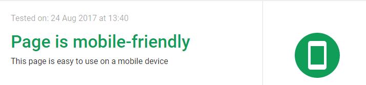
Google have a handy Mobile-Friendly Test tool which scores your website against how mobile friendly it is. Give it a go and let us know your results.
Digital Marketing For Printers
We’ve put together a fantastic infographic about the ingredients needed to form a successful digital marketing campaign in the print sector. You can view it here.
Flex 4 have been providing best-in-class W2P solutions and digital marketing services for print and graphic design businesses since 2004. We have numerous satisfied customers right across the country. We are UK-based – all of our team work out of our office in Kendal. We pride ourselves on our customer service, flexibility, and desire to please – we would love the opportunity to show you what we’re capable of.
If you’d like to request a free demonstration of our web to print solution click here, or here for our contact page, or call us any time on 020 7952 8160. As always we will be delighted to answer all of your questions and give you all the help that you need.